Book process
Creating a vision for the book process that addresses main user pain points and provides a scalable framework for future experimentation and expansion.

Why
Problem & Opportunity
Booking.com launched its flight product in August 2019. I joined the team in December 2019 and the first thing I did upon joining the team was to initiate a funnel analysis.
This study aimed to establish guidelines and a framework that will enable flights to transition from MVP, which launched in 9 countries, to scale on a global level and enable expansion of features that will make Booking flights a
global competitor.
My first focus was on the book process, where I worked on creating a scalable framework that ensures cohesive experience across multiple platforms (desktop, mdot, iOS and Android). Creating a framework will enable easier scalability of new features, address major user pain points from MVP release and enable a cross-platform feature parity.
Working on this project, I collaborated with stakeholders from within the company, key stakeholders from our supplier partner eTraveli and teams across the company to align on common patterns and user experience for the book process.
My role
Initiated project and got a buy-in from business and engineering to invest work into proposed changes and placed the project on roadmap
Lead the project from UX side, collaborating with copywriter, researcher and designers within flights organization
Collaborated with the Product Manager, Front-end developers, Back-end developers, Engineering Manager and Copywriter to map needed changes
Sought regular feedback from peers and stakeholders in ad-hoc meetings and regular Flights UX Review meetings
Collaborated with other designers across our organization working on the check-out process for other products to align on common patterns
Worked together with our design systems team to create new design components
Created a fully interactive high-fidelity prototype in Framer for
user testing
Collaborated with the UX Researcher to lead remote user testing
Created design documentation of the new check-out process for web and native apps
Hand-off with developers and ensuring implementation aligns with designs by contributing to merge requests (Read more about the process of collaboration with developers)
Time
Q4 2019 - Q1 2020
Team
Designer (me)
Product Manager
UX Researcher
UX Copywriter
FE Engineers
BE Engineers
Scope
Web implementation (desktop & mdot)
Native apps implementation (iOS & Android)
Process
My design process continuously adapts based on a problem I am facing. However, I follow these three simple steps: Understand, Define and Create. With every step, I also involve my team, either for a brainstorm or to ask for feedback.
While working on the book process project, I involved different stakeholders and peers at various stages to get the most relevant feedback. For example, I involved the Product Manager, the Engineering Manager and one of the Back-end developers when doing wireframes to present my intended changes, get their feedback and plan development efforts needed for changes. Then I involved supply partner so they can plan proposed changes in their roadmap.

Process → Understand
Analyse data, research and user feedback
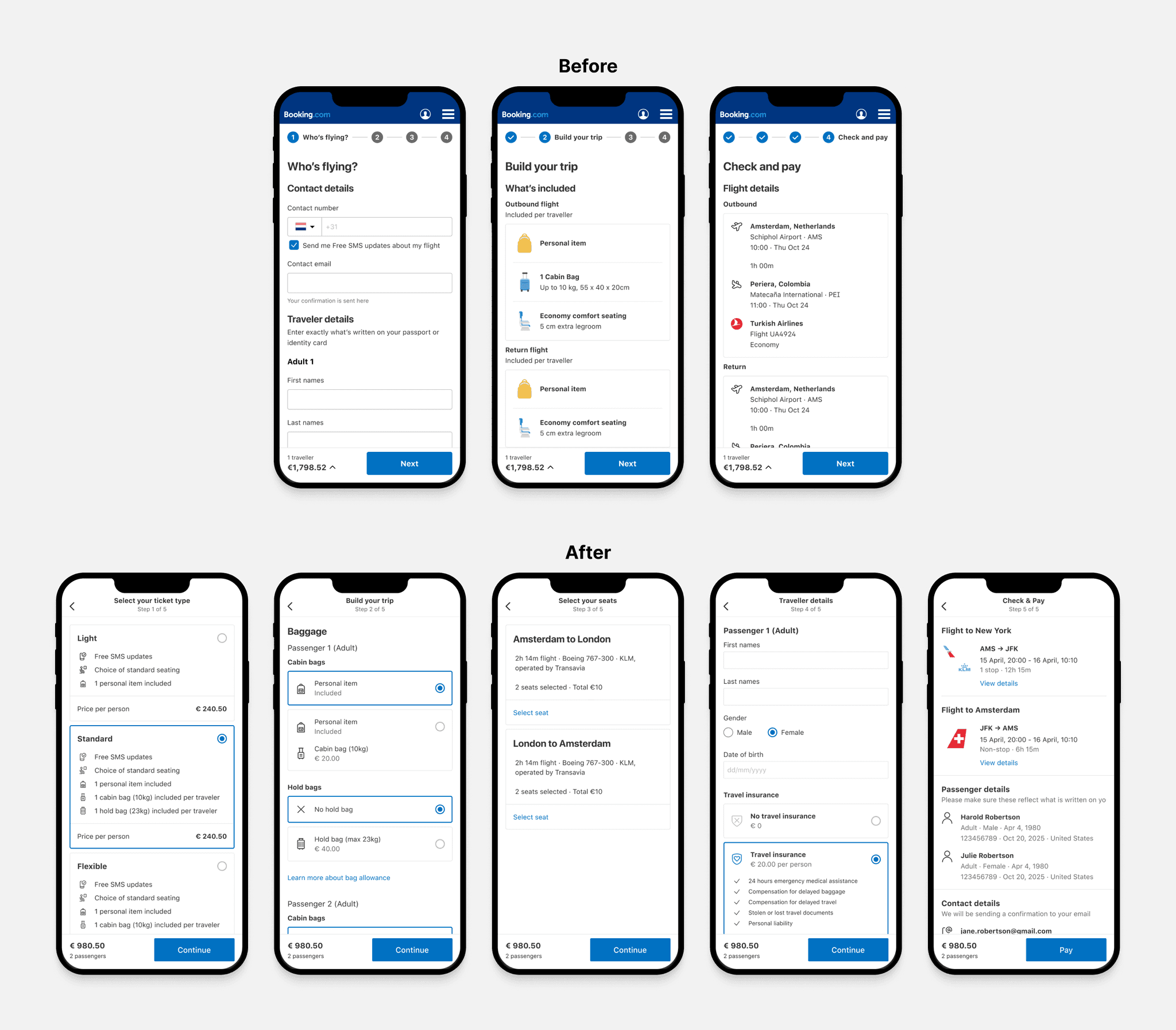
I analyzed the current funnel conversion rate to understand how the users are currently navigating through the product. There was a significant drop-off from traveler details (the first step of the book process) to customize your trip. What was even more interesting is that majority of users went one step back from traveler details to flight details.

Process → Understand
Looking at user feedback
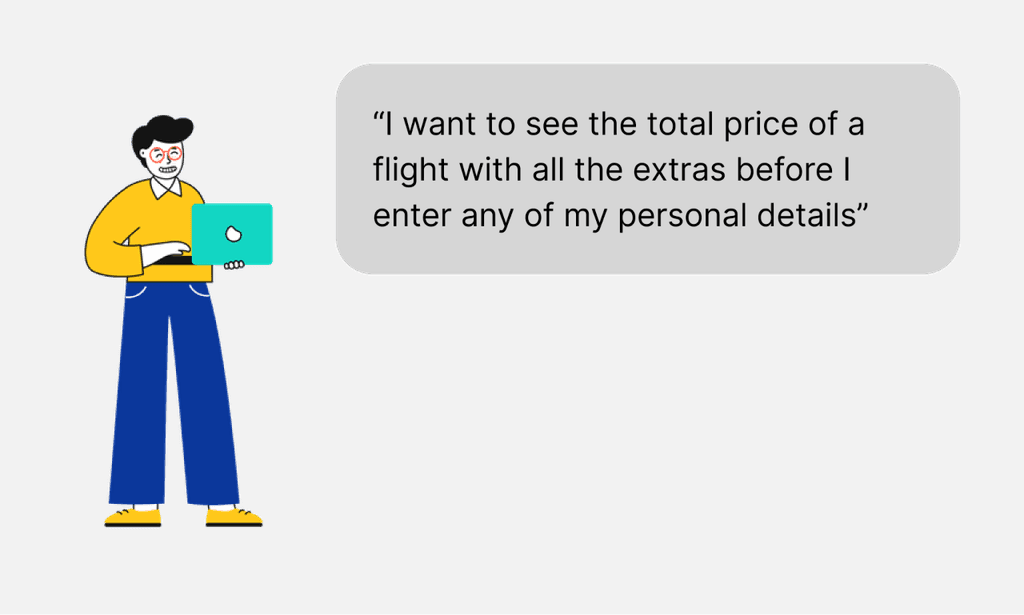
To better understand such a significant drop-off, I looked at the user feedback data from past user tests and user feedback form. One particular feedback stood out - users wanted to see the final price (with all ancillaries) before committing to entering personal details.
Process → Understand
Competitor analysis
To better understand how others tackle challenges in the book process, I created a competitor analysis of competitor OTAs offering flights, flight meta engines, and some airlines.
I was focusing on how the book process is structured, way of collecting information, number of steps and grouping of certain items.

Process → Define
Design Requirements Document
I always start projects in Google docs (or some alternative writing tool), where I outlined the main problem statement, list all relevant requirements (and link them to the team's objectives), list technical dependencies and mark all team members' stakeholders in this project.
By doing this, I prevent myself from starting a project in the design tool but rather focus myself and the team on the problem we are solving rather than a solution that might solve it.

Process → Define
Flow with features
The most significant change in the funnel was structural. Based on data and feedback, I have decided to move the step of entering personal details to the last one. By creating a simple flow chart of the new proposed book process and highlight where certain elements and features are placed, I could start conversations with Engineers and Product Managers.

Process → Define
Low-fidelity wireframes
I created very low-fidelity wireframes, where I mapped out all proposed changes in our funnel. With this, I was able to get a better representation of how it would look and start a conversation with others and not spend too much time with high-fidelity.
In this step, it was essential to involve the product manager, developers, and our supply partner to discuss the feasibility of changes and advocate for significant changes (changing steps in book process), which required substantial changes in our infrastructure, but provide future scalability and improves user experience.

Process → Create
Interaction design exploration
After finalizing the flow and locking up the sections with wireframes, I started exploring visual designs and patterns. I went section by section, starting with baggage. By doing this, I was able to go very wide with explorations, and by asking for feedback continuously, I was able to create final iterations that consider all the use cases.
In this process, I also worked very closely with our copywriter to tackle user problems together and create solutions that solve user pain points from a design and copy perspective.
When doing different iterations of my designs, I had many ad-hoc 1-1 discussions with different peers (other designers in my team, copywriters, developers), so I quickly validated some of my ideas and moved towards the solution.

Interaction design exploration -Baggage section
I started with the baggage section, as this one is the most challenging section due to so many possible variations (included, not included, the difference in allowance between adults and children, etc.) and technical limitations (due to constraints by our integration with supply partner). I progressed through iterations by getting regular feedback from the team and testing some of my concepts with users.

Option 01
More complex interaction as clicking Add opens another view where you select a number of bag items.

Option 02
Felt like overkill for simpler cases, also not possible to assign bags to a person.

Option 03
Radio selection is hard to click on mobile devices, illustration and bag overview is a pattern we don't use anywhere.

Option 04
Radio buttons felt like a good option for mobile and desktop devices. Still included and not included as separate sections.

Option 05 - Chosen
Use radio buttons, showing included and not included together.
Process → Create
Creating new interaction pattern
When working on this project, I identified a need for a new interaction component - the Selection Card (a combination of radio and card components).
This component offers a bit bigger touch target (for mobile devices) and enables showing different levels of content - opposed to a regular radio button where you can add only 1 line of text.
When creating this component, I lead collaborating with designers from the Design System team and with designers and developers from the Accommodations book process to look at various use cases and prepare the component in a scalable way.
The final proposal for the Selection Card component includes the component as Container and also some predefined patterns. The component is already live in SwiftUI and waiting for implementation
on other platforms.

Process → Create
High-fidelity design
Following the exploratory phase, I finalized the first round of high-fidelity designs. I implemented all the feedback I got from my team and peers and created a Framer prototype for user testing.
Most significant changes:
Offering ancillaries contextually (travel insurance with personal details, baggage as a separate section).
Enabling selection of ancillaries directly on the page - no more opening of modals.
Using selection cards for selecting ticket types and ancillaries.
Move from the use of illustrations to iconography to align with the rest of the Booking.

Process → Understand
Prototyping & user testing
To understand if our improvements affect the user experience and understand what we did wrong, we put the prototype in front of users.
But just as we were finalizing the testing plan, COVID-19 hit the world hard. In these uncertain and challenging times, the company took precautions and stopped all unnecessary spending (usertesting.com being one of them). And secondly, we also morally didn't want to test with external users, as at these times traveling was the last thing on everyone's mind. But to not stop the project and still gain some insights from users, we came up with a clever solution of utilizing our employees and ran user testing with them.
Booking.com is a big company with employees in different roles and backgrounds. We have decided to leverage that and run user testing with our co-workers not working in design or development.
Tools like usertesting.com were unavailable at that time, so we had to improvise. Together with the UX Researcher, we decided to do interviews via BlueJeans and stream them into the private Workplace group. This way, the participants didn't feel like being observed while still allowing others to watch videos.

Process → Understand
Learnings from testing
Results from user testing confirmed the majority of our assumptions and didn't show any major blockers, but we learned some valuable insights and points to improve.
👍
All users had no problem navigating through flow and were able to complete the task (book a flight).
👎
All extras and ancillaries should be shown in one place. Users want to compare different options to understand what is best for their case.
👎
Luggage should be displayed in the same way across the whole funnel.
Process → Define
Implementation strategy
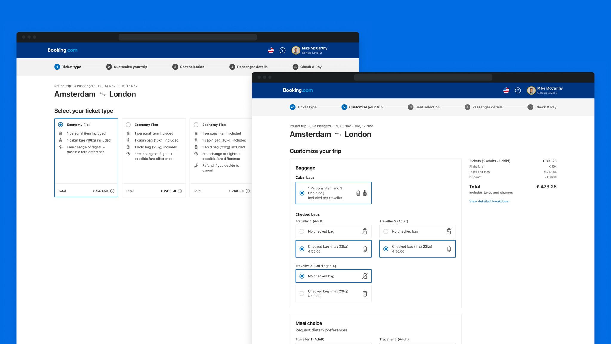
Based on user testing results, I made some changes to our designs, specifically moving all the ancillaries on the same page (as users expected to have all add-ons together) and optimized baggage display to use the same type of display throughout the product (showing bags per person).
After designs were finalized, I sat down with our Product Manager and Engineering Manager to split down work into multiple projects and place them on our team's roadmap. Each project addressed one of the features of pages of the check-out funnel.
In the following months, I created fully detailed documentation for each of those projects and collaborated closely with our engineering team with implementation.

Process → Define
Implementation
Implementation result for native apps, after taking learnings from this project and tackling each section of the book process as a separate project.


My impact
Improved attach rate of flexible tickets, which positively improved our margins and provided users with security they needed to feel confident about their booking during the pandemic.
Provided clarity to our users with simpler baggage information resulting in higher attach rate and higher user satisfaction, as bags are one of the key differentiators in the flight industry and one of most essential ancillaries to our users.
Created a long-term foundation for book process which addresses main user pain points and enables future scalability for new features (e.g., branded fares).
By testing early in the design process, we quickly validated some of our assumptions and optimized design decisions without spending resources on the development.
I involved my team and the technical department from the supplier early in the process by sharing flows and wireframes with them. By that, we were able to identify some of the technical blockers and better plan more extensive technical changes.
Creating a well-defined vision for the book process and defining a framework that considers future scalability ensured that we can provide a coherent booking experience for our users despite each of the smaller projects being picked up one by one by our development team.
Started a bigger BE lead project to offer more scalability in our book process by creating our own Booking.com flights cart, which will enable us to move different steps of the book process around.
Learnings
Test early and often to avoid spending too much time in the wrong direction and get users' feedback as soon as possible.
To provide a coherent experience for our users, we need to have a well-defined vision of our product that takes into consideration all future scalability.
Involve your team in each step of the process; this way, you learn about technical limitations, product strategy and get valuable insights from your team members.